How to Actually Study for IB Economics, with Worked Examples for Papers 1, 2 and 3
Quick answer: I scored 25/25 for my Paper 1 and 39/40 for my Paper 2 when I sat my Economics SL exam in 2022. My Bachelor of Actuarial Studies (CB2) has taken me well beyond that, covering HL and university-level content in great detail including monopolies, cost curves, monetary policy tools, the Keynesian multiplier, and more. That means I can support HL students through content I have engaged with at a deeper level than the IB course itself requires, not just the SL syllabus I originally sat.
IB Economics rewards precision over volume: relevant theory, precise terminology, correctly drawn diagrams, well-developed real-world examples, and balanced evaluation, all appearing together. The exams test this differently across three papers, and most students only practise one style. I started off weak at this. I understood the theory but could not evaluate properly, did not connect diagrams to explanation, and lost marks on things that were completely fixable. This post walks through past questions from each of the three papers (Paper 3 is HL only).
10-Marker (Paper 1)
Example
Explain why the price elasticity of demand for primary commodities is often low while demand for manufactured goods is often high (SL, May 2021, TZ2)
It is imperative to start every Paper 1 response with a short paragraph accurately defining the key terms in the question prompt. For terms such as the unemployment rate, PED, and GDP that can be calculated, an appropriate definition is the formula itself.
- PED = (% change in quantity demanded) ÷ (% change in price), or the responsiveness of quantity demanded for a good or service to changes in price.
- Primary commodities are raw, unprocessed goods (wheat, oil).
- Manufactured goods are processed or finished products (clothing, electronics).
What immediately follows are the diagram(s), which tell the clear story of cause and effect and validate the economic theory. A well-constructed diagram should map out the initial situation, illustrate the shift (a tax, a subsidy, a price shock, and so on) and the final equilibrium to demonstrate the economic impact. Since this question does not involve a policy implementation, there would not be a shift in either curve:
Lastly, an explanation is required. By making reference to the diagram, you must answer the question. This requires an understanding of the determinants of PED:
- Primary commodities have very few substitutes (oil, wheat). If their price rises, consumers cannot substitute the good for something similar, so the % decrease in quantity demanded is low, as shown by the steep demand curve. This is the effect: demand is inelastic because quantity demanded barely falls when price rises.
- They are necessities because they are inputs everyone uses, whether in daily life or production (petrol). People cannot stop using them when prices rise, so demand stays inelastic.
- Primary commodities typically constitute a low proportion of income compared to manufactured goods. A pair of designer jeans represents a noticeable chunk of a household's monthly discretionary spending, so when the price rises, households are more willing to delay the purchase. Demand for manufactured goods is therefore more elastic because quantity demanded falls by a larger % when price rises.
Common mistake: stopping at the definition and diagram without explicitly linking each determinant back to why it causes high or low elasticity.
15-Marker (Papers 1 and 2)
Example
Evaluate the view that inflationary pressures in an economy are best reduced using supply-side policies (May 2019, SL, TZ2)
15-markers follow the same structure as 10-markers: definitions, diagram(s), and explanations linked to the diagram. They also require evaluation of a policy's effectiveness and real-world example(s) as evidence. For the 13–15 mark band, examiners look for:
- The specific demands of the question are understood and addressed
- Relevant economic theory is fully explained
- Relevant economic terms are used appropriately throughout the response
- Where appropriate, relevant diagram(s) are included and fully explained
- The response contains evidence of effective and balanced synthesis or evaluation
- A relevant real-world example is identified and fully developed to support the argument
Definitions
- Inflation is a sustained rise in the general price level of an economy over time (or the % increase in the CPI over a specified period).
- Inflationary pressures are forces pushing the price level upward, from the demand side (demand-pull) or supply side (cost-push).
- Supply-side policies are government measures aimed at increasing an economy's productive capacity, shifting long-run aggregate supply (LRAS) to the right.
Explanation
Because there is now a policy implementation, you must explain two things: how the policy causes the shift in LRAS (or whichever curve moves), and the resulting impact on the economy at the new equilibrium (price level and real GDP for macro questions).
Market-based supply-side policies work by reducing government intervention and increasing competition (deregulation, privatisation, anti-monopoly policy). These shift LRAS right because removing red tape and increasing competitive pressure forces firms to become more efficient and lowers production costs, allowing the economy to produce more at every price level as price falls from P₁ to P₂.
Interventionist supply-side policies involve direct government action: subsidies for R&D, investment in education and training (human capital), and infrastructure spending (physical capital). These shift LRAS right because the government directly funds an increase in productive capacity, leading to real GDP rising from Y₁ to Y₂. Better-trained workers produce more per hour, and improved infrastructure or R&D allows firms to produce more efficiently or develop new technology.
For example, South Korea's investment in human and physical capital from the 1960s onward is a clear case of interventionist supply-side policy. Following the early-1960s policy shift, per capita output grew at roughly 7% per year for the next 25 years, with GDP per capita rising from around $100 in the early 1960s to over $20,000 by 2007. Government education spending reached 2.2% of GNP by 1975, and R&D intensity climbed from 2.24% of GDP in 1996 to 4.23% by 2015.
However, this government spending is itself a component of AD (through G), so in the short run interventionist supply-side policy can actually increase AD before the capacity-building effect shifts LRAS over the longer term. The policy can be mildly inflationary in the short run, even though its intended long-run effect is disinflationary through expanded capacity.
Evaluation
In the IB, evaluation means critically assessing strengths, limitations, and underlying assumptions. Weigh the pros and cons, challenge assumptions, and compare with alternatives.
Advantages of supply-side policy
- Increases real GDP while simultaneously reducing the price level, a combination demand-side policy cannot achieve
- Increases employment, since higher productive capacity typically requires a larger workforce
- Particularly effective against cost-push inflation, because it addresses the underlying capacity constraint
- Can improve long-run economic efficiency, especially with market-based policies that increase competitive pressure
Disadvantages of supply-side policy
- Market-based policies can worsen equity: benefits often accrue to firms and higher-income earners while lower-income groups face weaker protections
- Interventionist policies place a direct burden on the government budget, potentially worsening a fiscal deficit
- Time lags are the most significant limitation: building infrastructure or shifting firm behaviour takes years, making supply-side policy poorly suited to urgent inflation
- Largely ineffective against demand-pull inflation, since the problem is excess demand, not insufficient capacity
Considering the alternative: contractionary monetary policy (raising interest rates) or contractionary fiscal policy can reduce inflation considerably faster, since they act directly on demand. The trade-off is lower real GDP and higher unemployment.
Conclusion: given the significant time lags associated with supply-side policy, a more appropriate real-world response to urgent inflationary pressure would combine both approaches: monetary policy in the short run to bring inflation under control quickly, while supply-side policies expand capacity over the medium to long term. Whether supply-side policy is "best" therefore depends on the source and urgency of the inflation. It is the stronger long-run solution, particularly for cost-push inflation, but it is not a substitute for faster-acting demand-side tools when the situation is urgent.
Paper 3: short-answer calculations (HL only)
Paper 3 covers many topics. Below is a worked example from a topic that often confuses students.
Example
Q3, May 2021 Session
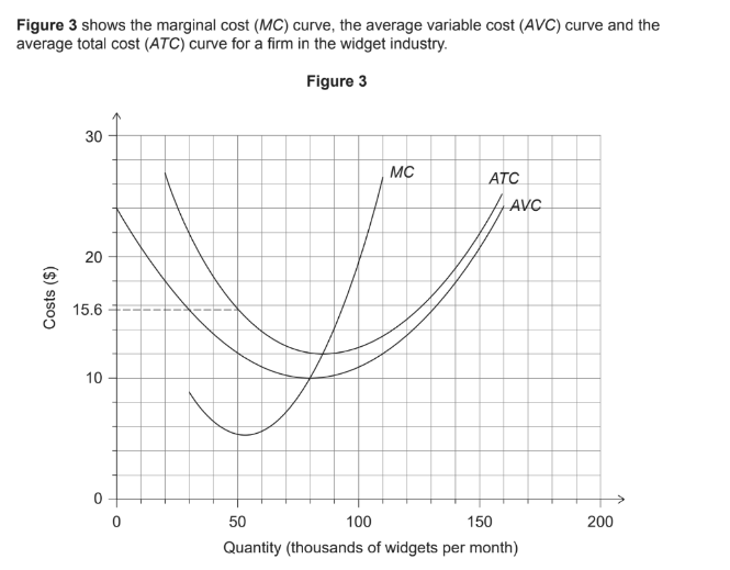
(i) Calculate the firm's total variable costs if output is 20,000 widgets per month [1]
Read the AVC value at Q = 20,000 (20 on the thousands axis) directly off the AVC curve. It looks to be around $18 at that point. Total variable cost = AVC × Quantity = 18 × 20,000 = $360,000.
(ii) Identify the level of output at which the firm would achieve productive efficiency [1]
Productive efficiency occurs at the minimum point of the ATC curve. Looking at the graph, ATC bottoms out at approximately 85,000 units. At this point, MC = ATC.
(iii) Calculate the firm's monthly total fixed costs if output equals 50,000 units per month [2]
AFC = ATC − AVC. At 50,000 units: 15.6 − 12 = $3.6. Then 3.6 × 50,000 = $180,000.
Need help with past papers, essay feedback, or IA commentary support?
Book your first lessonBacked by our money-back guarantee.